
Introduction
Creating an eye-catching vinyl banner is essential for capturing attention in high-traffic environments. However, this task goes beyond merely combining graphics and text; it requires a strategic design approach that maximizes visibility and engagement. Designers must navigate the challenge of balancing aesthetics with functionality. How can one ensure that their message is not only seen but also resonates with the audience?
To address these challenges, this article explores essential design principles, including:
- Optimal size and layout
- Effective color choices
- Messaging strategies
By understanding these best practices for crafting a 10x10 vinyl banner, designers can enhance their creations and significantly improve audience interaction. Ultimately, this guide equips readers with the necessary tools to elevate their banner designs and effectively capture attention.
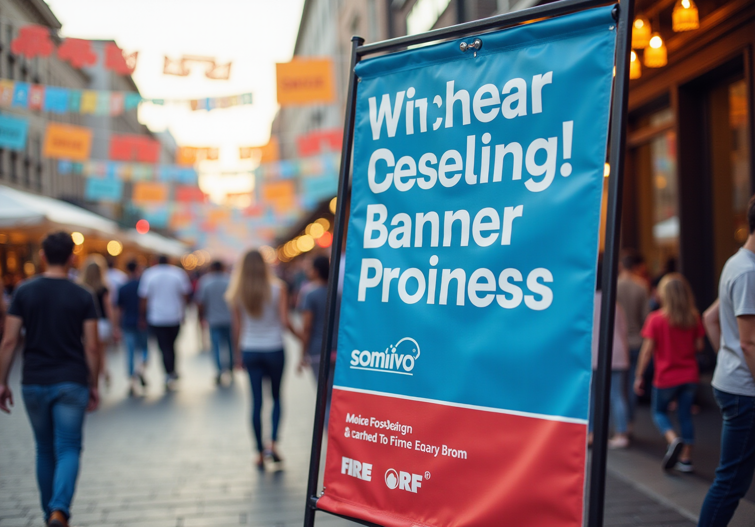
Define Size and Layout for Maximum Impact
When creating a 10x10 vinyl banner, determining the optimal size is essential for maximizing impact in event spaces. The situation is that text must be legible from a distance, with a widely accepted guideline suggesting that letters should be at least 1 inch tall for every 10 feet of viewing distance. Consequently, for a 10x10 vinyl banner, this means utilizing large, bold fonts that ensure readability from afar. Furthermore, employing contrasting colors between the text and background significantly enhances visibility, allowing your content to stand out effectively.
In addition to size, the layout plays a crucial role in capturing attention. A balanced layout with a clear focal point enhances visibility and engagement. Applying the rule of thirds can effectively arrange key elements, ensuring that your logo and primary content are prominently displayed. This strategic approach not only boosts visibility but also reinforces brand recognition in bustling environments, where competition for attention is fierce.
Experts in graphic design emphasize that effective signage must capture attention and communicate messages swiftly. As Joel Spolsky aptly notes, "Design adds value faster than it adds costs," underscoring the necessity for clarity and impact in your design choices. Furthermore, consider the strategic placement of your advertisement in high-traffic areas to maximize exposure. By concentrating on these principles, your 10x10 vinyl banner can transform into a powerful tool for engagement at events.

Select Colors and Branding Elements Wisely
Color selection plays a crucial role in banner design, serving as a powerful tool to convey brand identity. However, many designers face the challenge of ensuring that their color choices not only reflect their brand but also maintain high contrast for readability. How can one effectively balance these elements? By selecting a hue palette that represents your brand while ensuring that bold hues are paired with neutral backgrounds, you can make your message stand out.
Furthermore, understanding hue psychology is essential. For instance:
- Blue conveys trust
- Red evokes excitement
- Green suggests growth
To maintain visual coherence and avoid overwhelming your audience, it is advisable to restrict your palette to three primary hues. Consistently incorporating your logo and brand elements reinforces brand identity, creating a cohesive visual experience.
This strategic use of color not only attracts attention but also fosters a sense of familiarity and trust among potential customers. Research indicates that 84.7% of individuals cite color as the primary reason for purchasing a particular product, while 80% believe that color enhances brand recognition. As branding specialist Brett Thomas aptly states, "Color doesn’t just embellish a communication - it determines how that communication is perceived."
In conclusion, grasping these principles can significantly enhance the effectiveness of your promotional displays. By implementing informed color choices and strategic branding, you can improve engagement and drive customer loyalty.

Craft Clear Messaging and Choose Readable Fonts
Creating an effective banner is crucial for capturing attention and conveying your message succinctly. The situation is clear: a well-designed banner can significantly impact audience engagement. However, many face complications, such as overcrowding the layout with excessive text or choosing inappropriate fonts. How can one ensure that their banner stands out while remaining readable?
To address these challenges, aim for a headline that captures attention in just a few words-ideally no more than ten. Research indicates that, on average, five times as many people read the headline as read the body copy, highlighting the importance of concise headlines. Utilize bullet points or brief phrases to communicate additional information without cluttering the design. When selecting fonts, prefer sans-serif styles like Arial or Helvetica, which enhance readability from a distance. Ensure the font size is large enough to be legible from at least ten feet away, and limit your design to no more than two different fonts to maintain a clean and professional appearance.
This clarity in messaging and typography not only enhances readability but also significantly increases the overall effectiveness of your display. As marketing experts emphasize, effective communication is essential; a well-crafted display can transform a simple notion into a compelling visual declaration that resonates with your audience. Furthermore, be mindful of common mistakes, such as overstuffing your layout with excessive text or using overly ornate fonts, which can undermine your communication.

Incorporate High-Quality Images and Graphics
Incorporate High-Quality Images and Graphics
High-quality visuals play a crucial role in banner design, acting as the initial point of engagement for your audience. The challenge lies in selecting images that not only resonate with your brand but also maintain clarity in large format printing. To achieve this, utilize high-resolution images with a minimum of 150 DPI. As Frank Chimero aptly states, "Good creativity is all about making other creators feel like fools because that concept wasn’t theirs," highlighting the necessity of originality in your visuals.
Furthermore, it is essential to choose graphics that enhance your text and overall design without overshadowing it. Icons or illustrations can effectively convey your message at a glance, making them valuable assets in your design toolkit. Additionally, ensure that all images are properly licensed or owned to avoid copyright complications. Research indicates that posts featuring images receive 94% more views than those without, underscoring the significance of compelling visuals.
To effectively apply these principles, consider the following actionable insights:
- Choose high-resolution images that align with your brand identity.
- Maintain a minimum of 150 DPI for clarity in large formats.
- Use graphics that complement your text without overwhelming it.
- Ensure proper licensing for all images used.
By incorporating these high-quality visuals, you not only attract attention but also create a lasting impression that strengthens your brand identity.

Conclusion
Designing an effective 10x10 vinyl banner is crucial for any promotional effort, as it serves as a visual representation of your brand. However, many face challenges in creating a banner that not only captures attention but also communicates a clear message. What are the key elements that contribute to a successful banner design? By focusing on size, layout, color, messaging, and visuals, one can overcome these challenges and create a compelling promotional tool.
To maximize impact, selecting an optimal size and layout is essential. Colors should reflect brand identity while ensuring readability, and concise messaging is vital for effective communication. Furthermore, incorporating high-quality images can significantly enhance the visual appeal of the banner. Utilizing large, bold fonts and high-contrast colors ensures legibility from a distance, while a cohesive color palette fosters brand familiarity. Clear messaging, paired with effective visuals, amplifies engagement and drives customer interest.
In conclusion, the success of a vinyl banner hinges on the thoughtful integration of these best practices. By applying these insights, individuals can elevate their promotional efforts and create lasting impressions that resonate with their audience. Embracing these design principles will transform your vinyl banners into compelling visual statements that not only attract attention but also foster deeper connections with potential customers.
Frequently Asked Questions
Why is determining the optimal size important for a 10x10 vinyl banner?
Determining the optimal size is essential for maximizing impact in event spaces, ensuring that text is legible from a distance.
What is the guideline for text size on a vinyl banner?
A widely accepted guideline suggests that letters should be at least 1 inch tall for every 10 feet of viewing distance.
How can I enhance the visibility of my banner's text?
Employing large, bold fonts and using contrasting colors between the text and background significantly enhances visibility.
What role does layout play in a vinyl banner's effectiveness?
A balanced layout with a clear focal point enhances visibility and engagement, making it easier for viewers to absorb the information.
What is the rule of thirds in banner design?
The rule of thirds is a design principle that helps arrange key elements effectively, ensuring that your logo and primary content are prominently displayed.
How can effective signage capture attention quickly?
Effective signage must capture attention and communicate messages swiftly, which can be achieved through clarity and impactful design choices.
What does Joel Spolsky mean by "Design adds value faster than it adds costs"?
This quote emphasizes the importance of clarity and impact in design, suggesting that good design can enhance the value of a product or message without significant additional expense.
Where should I place my vinyl banner for maximum exposure?
Consider placing your advertisement in high-traffic areas to maximize exposure and engagement with your target audience.
List of Sources
- Define Size and Layout for Maximum Impact
- The Ultimate Guide to Creating Perfect Vinyl Banners (https://campbellssot.com/news/vinyl-graphics/the-ultimate-guide-to-creating-perfect-vinyl-banners-2)
- How to Design Outdoor Banners in 2025 That Truly Impress (https://arrow-digital.com/how-to-design-outdoor-banners-that-actually-get-noticed-in-2025)
- 40 Graphic Design Quotes to Draw Inspiration From (https://snappa.com/blog/graphic-design-quotes)
- 22 famous graphic design quotes (https://99designs.com/blog/creative-inspiration/10-famous-design-quotes)
- 100 design quotes to ignite your inspiration (https://canva.com/learn/design-quotes)
- Select Colors and Branding Elements Wisely
- Color Psychology Facts and Statistics (https://colorlib.com/wp/color-psychology-facts)
- The Influence of Color Psychology on Consumer Response in Advertising (https://cbs42.com/business/press-releases/ein-presswire/860614303/the-influence-of-color-psychology-on-consumer-response-in-advertising)
- BEST COLOR PSYCHOLOGY IN BRANDING STATISTICS 2025 (https://amraandelma.com/color-psychology-in-branding-statistics)
- Everything you need to know about colors when creating a banner or poster for your business (https://augustafreepress.com/news/everything-you-need-to-know-about-colors-when-creating-a-banner-or-poster-for-your-business)
- The Psychology of Color in Marketing & Branding — 2024 Vision (https://medium.com/@illuminz/the-psychology-of-color-in-marketing-branding-2024-vision-c5f7b1c1c185)
- Craft Clear Messaging and Choose Readable Fonts
- Trade Show Banners Best Practices Unlocked (https://e-arc.com/article/designing-trade-show-banners-for-maximum-visibility)
- 87 Digital Marketing Quotes to Inspire You (2024 Update) (https://activecampaign.com/blog/digital-marketing-quotes)
- 80 Content Marketing Quotes That Will Transform Your Strategy (https://deliberatedirections.com/content-marketing-quotes-industry-leaders)
- 85 quotes about communication in business to motivate teams and leaders (https://textline.com/blog/quotes-about-communication-in-business)
- 120+ Glorious Marketing Quotes To Empower and Inspire You (https://moosend.com/blog/marketing-quotes)
- Incorporate High-Quality Images and Graphics
- 16 Best Graphic Design Quotes of All Time (https://andacademy.com/resources/blog/graphic-design/best-graphic-design-quotes)
- Industry Studies And Insights On Why You Need To Choose Better Photos For Your Marketing Efforts (https://forbes.com/sites/bernhardschroeder/2022/10/12/industry-studies-and-insights-on-why-you-need-to-choose-better-photos-for-your-marketing-efforts)
- 40 Graphic Design Quotes to Draw Inspiration From (https://snappa.com/blog/graphic-design-quotes)
- Visual Content Marketing Statistics: 52 Must-Know Insights (https://sproutworth.com/visual-content-marketing-statistics)
- 11 Startling Statistics that Underscore the Value of Visual Marketing - The Dingley Press (https://dingley.com/11-startling-statistics-that-underscore-the-value-of-visual-marketing)